Canadian Premier League Gets a Fresh Look
FEATUREDCPL
Refreshed brand reflects growth, ambition, and Canada’s identity in soccer

New Logo in Coordinated National Rebrand
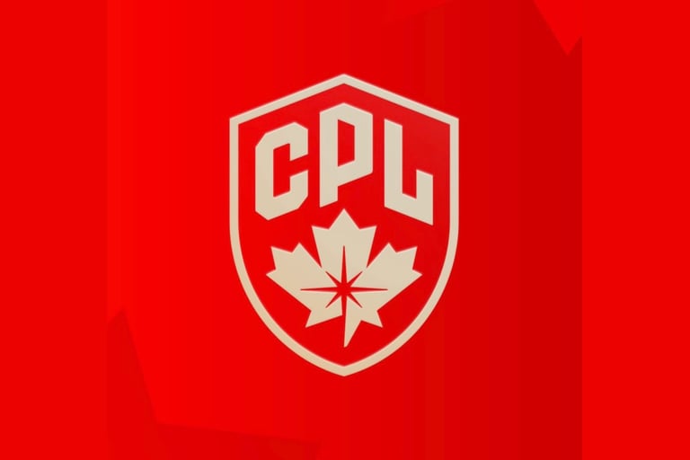
The Canadian Premier League has stepped into a new era with a striking updated logo, part of a wider visual evolution led by Canadian Soccer Business. Launched alongside the rebranded Premier Soccer Leagues Canada, the refresh creates a cohesive identity across professional, semi-professional, and community soccer in the country. The new design aims to capture the league’s ambition, performance, and national pride, highlighting its role as Canada’s premier domestic men’s competition while signaling the growth and alignment of the nation’s soccer pathway. Fans now get to decide, does this bold new look match the league’s rising profile?
Read in: Español
El Fútbol Canadiense se Renueva
La Canadian Premier League se puso las pilas con un logo que grita nueva era, justo a tiempo para el año que celebramos el Mundial. Junto al relanzamiento de Premier Soccer Leagues Canada, todo el fútbol profesional, semi-pro y comunitario de Canadá ahora tiene un look más unido y con gran flow. El diseño busca mostrar ambición, nivel y orgullo nacional, dejando claro que la CPL es la casa del fútbol masculino profesional en Canadá. Ahora les pregunto: ¿qué opinan del cambio?